OVERVIEW

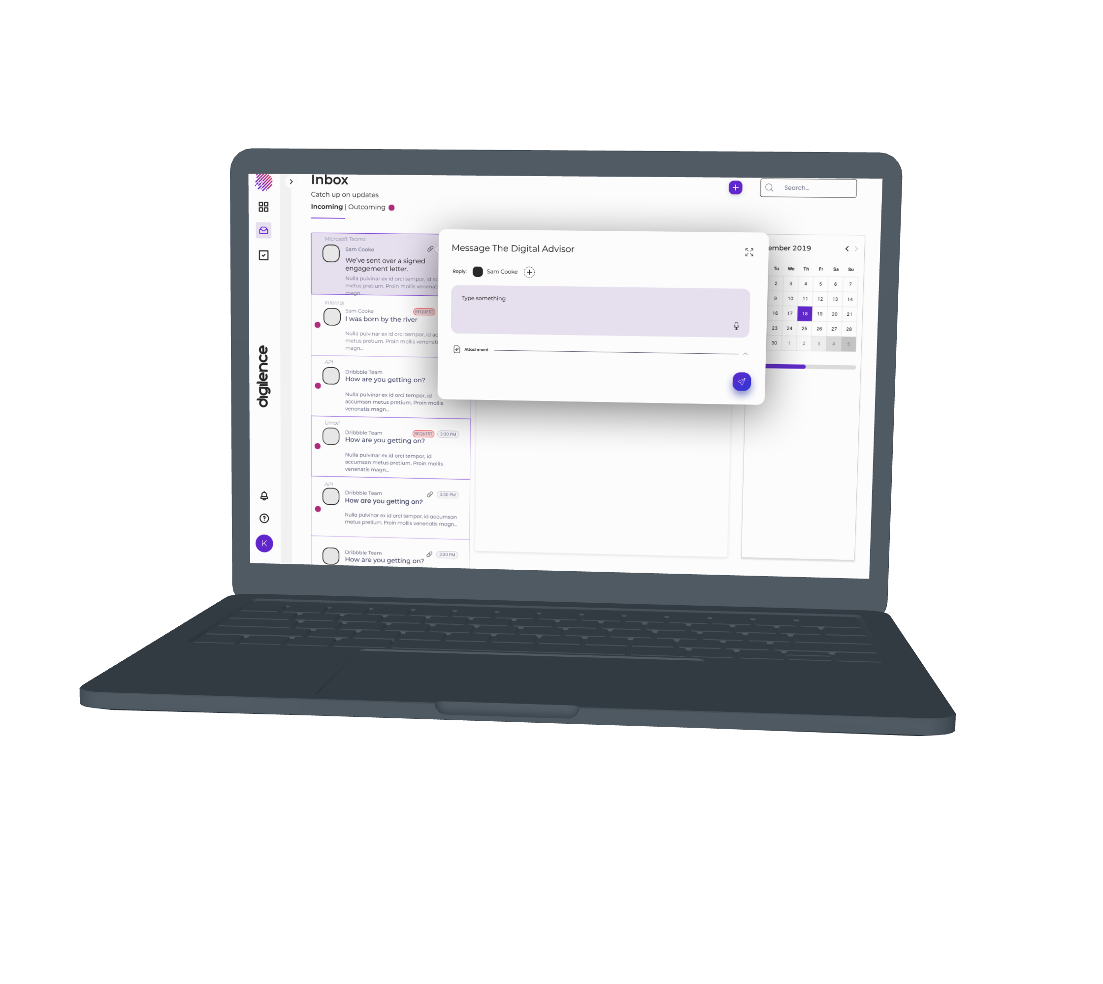
Digilence is a new webapp and product that is looking to revolutionize the tax industry as a service for the accountant vs the filer. I was asked to come in and work for Digilence as a designer, specifically to work on some feature design and iteration in the user’s inbox and digital organizer (“advisor”).
ROLES AND RESPONSIBILITIES: Product designer focusing on feature design
PROBLEM STATEMENT: It takes too long to complete a normal workflow as an accountant. Can technology / a tool fix this issue, especially with innovative features?
SOLUTION: Create concepts and elevate them for this industry, giving the user a very organized experience - using a digital advisor to help automate and an inbox to alert / organize
OPPORTUNITY: Create accommodating, streamlined features on a dashboard platform influenced by project management / email software
DOMINIQUE: To develop seamless integration of a file organization service on the site, and also an updated inbox.
DISCOVERY AND RESEARCH
I reviewed the overview of the industry and user needs and looked the current user flows to discover some context needed and generate questions that could be answered via design
Tax admin –
The tax admin is the general day-to-day user. By admin, it’s more “administrative” and not “administrator”. These are generally older, predominantly women, relatively low technology exposure, etc. They’re used to Excel and other basic tools, and doing the same thing every day for years. They hate busy seasons (tax deadlines), because it means 80 hour weeks and endless stress.
Tax leaders – These are generally partners in the firm, or director level people. The tax admins generally report to them, and they’re focused more on growth of the firm, overall performance of the tax practice and other things
CIO – The C(Information)O is generally concerned with how well the solution performs for the firm, security and other things. They’ll likely need access to IT administrator tools in the platform, but won’t really care about the productivity tools and other things
CEO/Managing Partner – The CEO is largely focused on firm performance, so they’ll be interested in how well tax is performing overall, metrics, financial performance and other details. They won’t care about the day-to-day functions
Digilence customer support – This is a Diligence employee that needs access to all of the above, because they’ll be providing support for these user types
Digilence administrator – This is a Digilence employee that needs administrator-level access to perform security functions: Adding/removing accounts, updating configurations, etc.
Once I had an understanding of the current users + the platform functionality, I created user journeys to understand how the accountant performs actions on this platform.
Competitive Analysis; Project Management Software:
Our client came to us with the idea of using Project Management software commonly used on tech teams as a starting point for discovery. He thought these tools made users feel informed of what was needed of them in both automated and manual uses.
So I looked into Monday's ui for a competitive analysis.
Above you can see various screens from Monday.com’s UI that I found relevant. The “learn and get inspired” section reminds me of the digital advisor user flow we want to create. I love the concept of the widget for assistance and the “search anything” concept to quickly go through to any person or document.
Overall, we loved the simplicity of these platforms, that often include logs or tables but are generally organized in a modern way that distances itself from calendars or pages that lack access to calls to action.
The unique inbox experience was something we wanted to pull from as well, especially the right hand “inbox view options” as a way to customize or sort through different types of mail (ex: automated vs. request from a client).
I also realized that some sort of “traditional” inbox features would be necessary for the inbox design. So I looked at platforms that are very commonly used by accountants like Microsoft Outlook and teams. These platforms very successfully show previews of who has contacted you, the name of the mail and a quick glimpse at the contents of the letter.
I’m leaving the discovery section of my design challenge with questions I want to answer in my feature design.
How are new clients added?
Any purpose for reporting beyond CEO/portfolio team?
Tax Calendar?
Workflow vs. Task?
PBC Checklists • imported? sent directly?
Alerts on Tax/Client??
How are we going to empower/educate each user?
How are teams being managed?
INFORMATION ARCHITECTURE
Now I know I understood the platform, the goals, the users, and the influences/competitors, I was able to create user flows that helped organize what the ideal experience would look like on diligence pre visual design.
Design Case Studies - Highlights
I have focused on three specialties; Product Transformation, User Research, and Data Visualization. The journeys there can be found below:


