an innovative tool for the Real Estate industry
A growth focused Case Study
UI TRANSFORMATION - LANDING PAGE
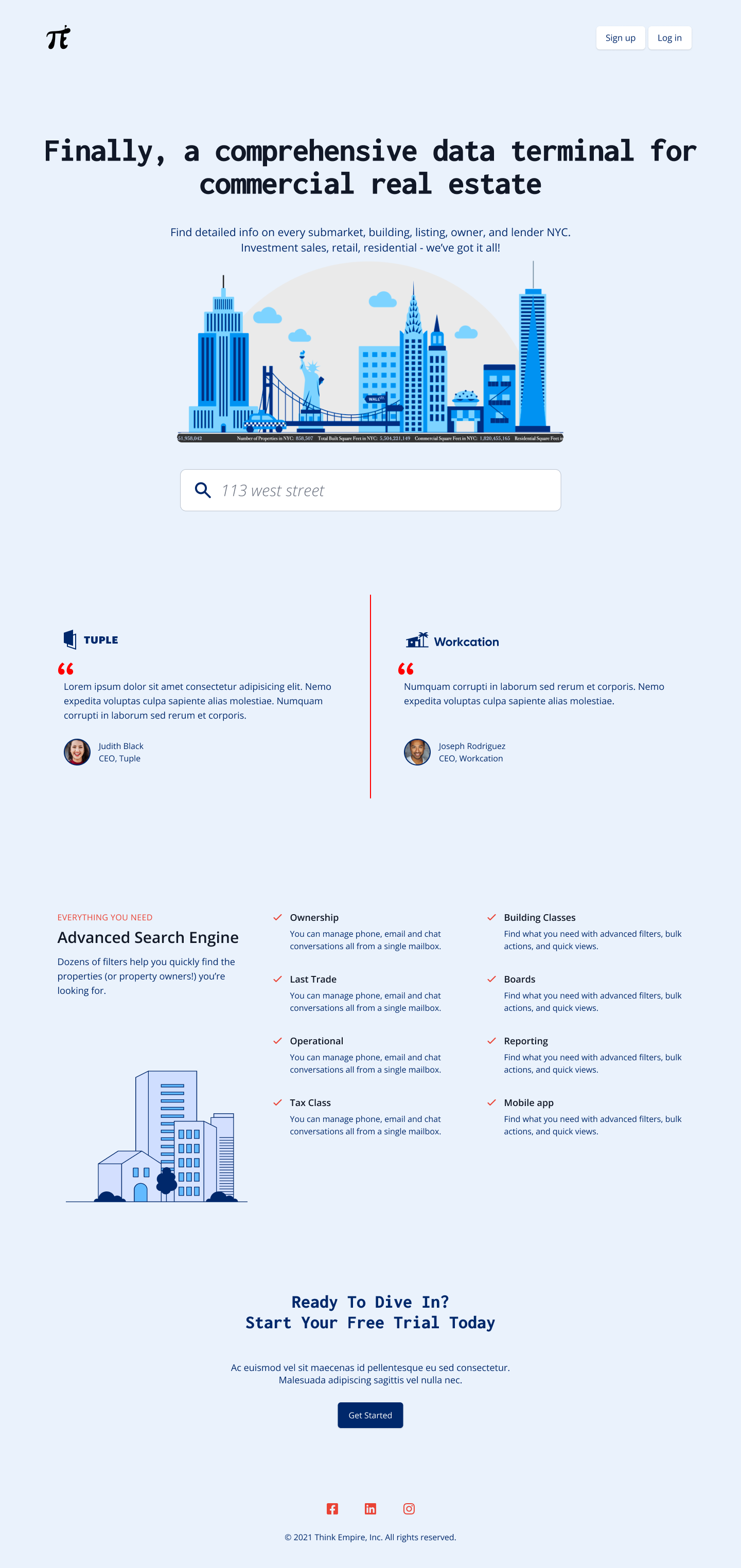 redesign
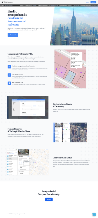
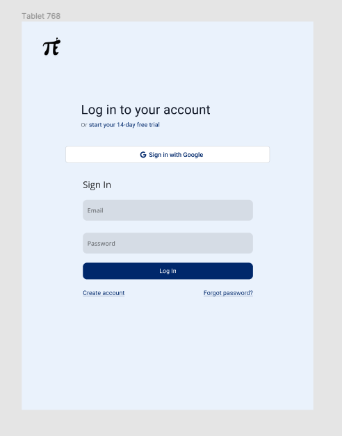
legacy design
OVERVIEW
There’s always priority from the buisness when doing a UX/UI design role, and we decided updating the splash one to be more attractive to potential users was an immediate need in the role. This case study will be explaining this 4 month excursion in growth for the original platform.
ROLES AND RESPONSIBILITIES: Lead / sole UI Designer, UX researcher and product designer, with emphasis on visual presence and marketing within my team
THE PROBLEM: My client needed to immediately work on their growth page to generate capitol via user memebership.
THE SOLUTION: Update growth page with a design that will seamlessly explain the websites functionality and increase conversion.
THE OPPORTUNITY: Learn about real estate industry users’ habits, focus on much needed visual design updates
DISCOVERY AND RESEARCH
Hotjar:
I used many forms of research for my client including google analytics, but hotjar proved to be the most effective for the splash page.
I set out asking my company to implement Hotjar so that we could gain insight and metrics regarding user conversion. Why weren’t users making it to the sign up page? Once we gathered results, I was able to gain information on user sessions and watch recordings of where they were getting stuck and abandoning the platform.
35% of users would immediately click on the sign in tab without reviewing the features of the platform on the splash page (likely active free users). 48% of users attempted to click on the images of the splash page (likely thinking it will take them to the logged in view). These were insightful outcomes for what needed to be changed and what was working well.
Hotjar is very effective for UI research as well, I was able to discern what parts of the splash page actually encouraged users to read / interact via watching how long they spent on the different sections. It also helped going forward by making sure we understood what features intrigued users’ the most.
COMPETITIVE ANALYSIS:
Next I looked at competitors for our product to learn how we could match/exceed their splash pages. Many of these sites clearly seemed more concerned about their internal pages than . their splash. I gathered additional ideas from sites with very modern and innovative UI on their splash page. I combined these two approaches for competitive analysis.
First, let’s look at some of these direct competitors.. Two I’ll be highlighting are Propertyshark and Costar.

- STRENGTHS: This page details the product’s functionality well, and has clickable links to listings and data points. This is what I thought our platform should have if we want to utilize direct images on the platform. The impressive testimonials would also appeal to our type of user, who enjoy the sense of community in real estate and depend on referrals and connections as part of their livelihood.
- WEAKNESSES: The UI / Visual design on this site is neither effectively organized, nor visually appealing. It would be a clear mistake on my part to mimic this site visually. It lacks any brand identity besides theSharkfin logo! They also have out-of-date metrics from early 2021, which shows little attention is being paid to this splash page.
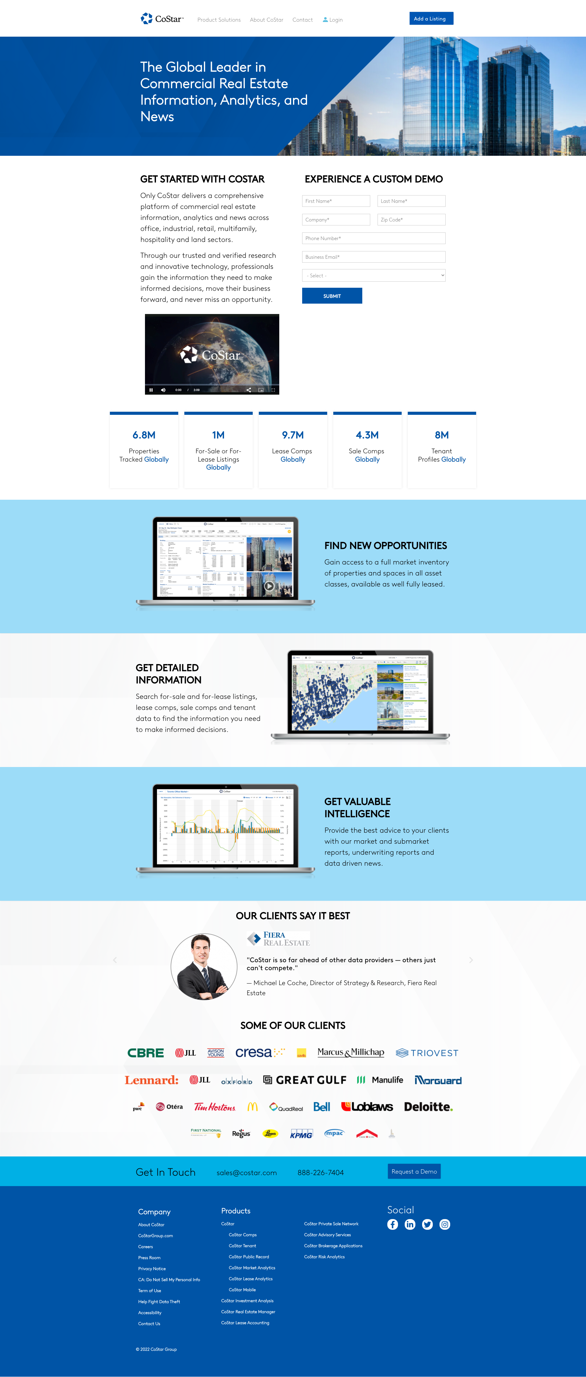
- STRENGTHS: The full sign up form on the homepage could result in saving time and increased conversion rates. I also enjoy the large metrics listed on the site as a clear drive for conversion.
- WEAKNESSES:This page is too simple in its design and appears boxy and hard to read. I also believe the images of the site on the rendered laptops aren’t much better then what my client currently had because they “say and don’t show” the product in action or ask the user to interact in any way. It seems to be doing the bare minimum in explaining the platform's functionality.
It’s worth mentioning that every button on both of these pages lead users to a free trial / demo since these products aren’t free (just like ours)
Next, I wanted to compare with Zillow, a leading real estate platform.

- STRENGTHS: This page is much more visually appealing. I enjoy the search under an inspirational quote, and how you're able to search for various things (e.g. addresses, zip codes, neighborhoods) with this search (as opposed to only an address). I also love the airy, lighthearted feel the illustrations bring to the site features. Additionally I appreciate how it is not long-winded in explaining the functionality, but rather instantly draws users to engage. Even though we are a paid product, we also need to quickly draw in users to actually use the platform.
- WEAKNESSES: On the same note, it doesn’t show enough information to draw in a paying user. It also encourages users to use the mobile app versus this site and ThinkEmpire does not yet have a mobile app.
I conducted a lot of research about this industry as a whole to better understand what potential users are looking for from data platforms. I made sure I knew the platform in and out so that I could best advertise our product on this critical page.
This research went on with my team throughout the redesign process, as it is important to constantly be learning and improving. I continued to monitor the Hotjar statistics throughout my time at the company. Breaking down the competitive analysis was important for upper management to better understand where we can fit into the playing field. The team was encouraged by my findings that we could definitely stand out from the competitors by using a modern UI on the splash page. We could also organize our information in a tactful way that educates the user but also urges them to act fast.
INFORMATION ARCHITECTURE
The above research helped provide insights on the best architecture for the splash pages.
TOTAL VISUAL REDESIGN: I wanted to completely change the appearance of this site, encouraged by modern airy splash pages with encouraging copy.
ALLOW USERS TO SEARCH: The research proved that a homepage search is a natural and common pattern that helps the user feel ready to use the product. I wanted to try out this approach since we allow users to demo certain parts of the website for free. I opted for a search bar under an H1 and H2 copy.
EXPLAIN THE SEARCH ENGINE: Although we’re a data platform, the main appeal of the platform is a search engine to parse through that data. Clearly listing the in-depth refining you can do with this search was essential. While I would’ve loved to show a gif of the search in action, we wanted to redesign that search as soon as possible as well so that wasn’t a MVP solution.
TESTIMONIALS / METRICS: Research pointed me in this direction as users like to know that other successful companies & individuals in their industry trust and enjoy this platform. Real estate users care deeply about metrics and therefore highlighting the amount of information available on the site or successful users was also important.
FOOTER: every site needs a footer, and ours will call the user to once again join after reading these metrics.
There were other features that came and went through trial and error:

This image shows a mockup of the splash page in mid fidelity which features more package and cost information. I decided to not show this in the splash page as marketing emails and other tools could encourage the users to subscribe. We also had many exclusive codes that would change the price of the packages so we didn’t want to confuse our user base.
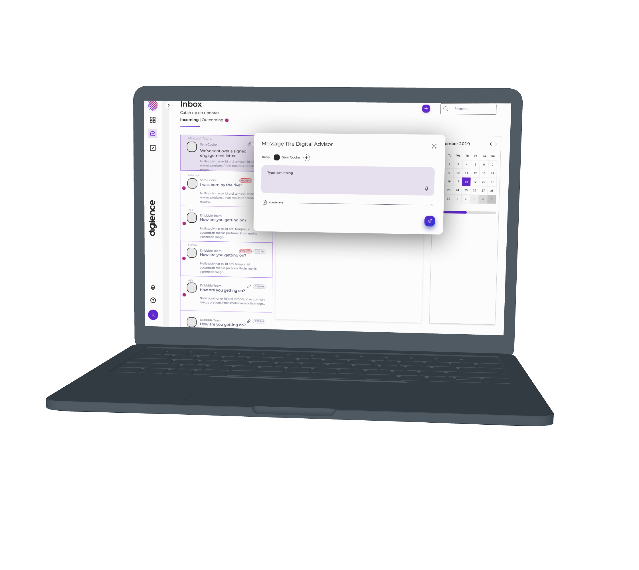
I also played with interactive elements to our splash page that mimicked the platform, but eventually found this to be counterproductive to navigating to the authorization pages.
IDENTITY:
I was working within the Tailwind UI design system to collab with the developers, so did not have complete creative freedom. I wasn’t permitted to change the logo or styling of the logo as well. With that said, I wanted to go with a calming blue as a backdrop for the splash page (and a new brand color). This is supposed to mimic a white/light background, but stand out and be unique. The dark mode of the site would be a soothing navy. I wanted to give the site a more youthful feel than it previously held by using sans type fonts to eliminate the rigid feel. I also took out color-blocked sections that break apart the platform. I made sure to reference Material.io’s spacing and accessibility recommendations that were not implemented in the existing design.


USER TESTING
After I had a high-fidelity prototype with copy, I wanted to talk directly to the current internal users of our site. Luckily, they worked in the same building and I was able to conduct an in person usability test. We were able to test 12 male identifying users (not by choice, it is all that was available). I wrote a script of scenarios for this splash page and monitored/recorded the users actions. I also asked pre and post test questions that were opinion-based to get both qualitative and quantitative results out of the test. Heres an example of the curser following tasks:
HOMEPAGE TASKS
Task 1: You heard about this new website called _______ from a friend where you can find all the data you need on local buildings for your process of attaining them. You’ve arrived on the homepage. What is the first thing you notice?
What do you expect will happen when you take that action?
Go ahead and take that action.
LEARN PAGE TASKS
Task 1: You want to learn what ThinkEmpire is. Without doing anything, where would you look for this information? Why would you look there?
What do you expect will happen when you take that action?
Go ahead and take that action.
LISTEN TASKS
Task 1: You want to know how much it would cost your brokrage to use ThinkEmpire. Without doing anything, where would you navigate on the site? Why would you navigate to that page?
What do you expect will happen when you take that action?
Go ahead and take that action.
GET INVOLVED TASKS
Task 1: You learned enough about ThinkEmpire and want to sign up for the service. How would you find information about entering your card information into ThinkEmpire?
What do you expect will happen when you take that action?
Go ahead and take that action.
Task 6: You feel inspired to ask some questions about the service and want to contact someone.
What do you expect will happen when you take that action?
Go ahead and take that action.
The results we got from this test were phenomenal. 84% of test takers said they were more likely to read the copy of the splash page simply because of the asethetic changes. 72% of users said they would be likely to use the search right on the home page, with the others saying they would prefer to log in first. While I hoped this would be an even higher result, users wern’t able to preform this action at all before so some might not be ready to change their flow. It helped us see the usability of this page compared to the hot jar metrics. It also helped us hear from our users on what they thought of the branding makeover and if they found the experience changes effective. If I had to change anything about this situation, I would bring in potential users as well to get that persepctive as if it was a new product.
FINAL THOUGHTS/TAKEAWAYS
As I finalized the designs for development, I was thrilled about the visual changes and testing results. We were able to trasform the brand identity, and make it easier to understand the platform functionality, as well as make the sign up / authorization user flow easier for potential customers. I’ve learned so much thru this growth redesign process studied an industry and users that have very specific patterns / needs. I’ve also learned so much about the importance of your splash page. This early communication with users can build trust and create intrigue verus drive them off or confuse them. Finishing up this project left me excited to get in and start working on the experience issues of the actual platform so that we can not only get users but keep them.
Design Case Studies - Highlights
I have focused on three specialties; Product Transformation, User Research, and Data Visualization. The journeys there can be found below: