POSY - Custom Flower + Plant Delivery Made Easy💐
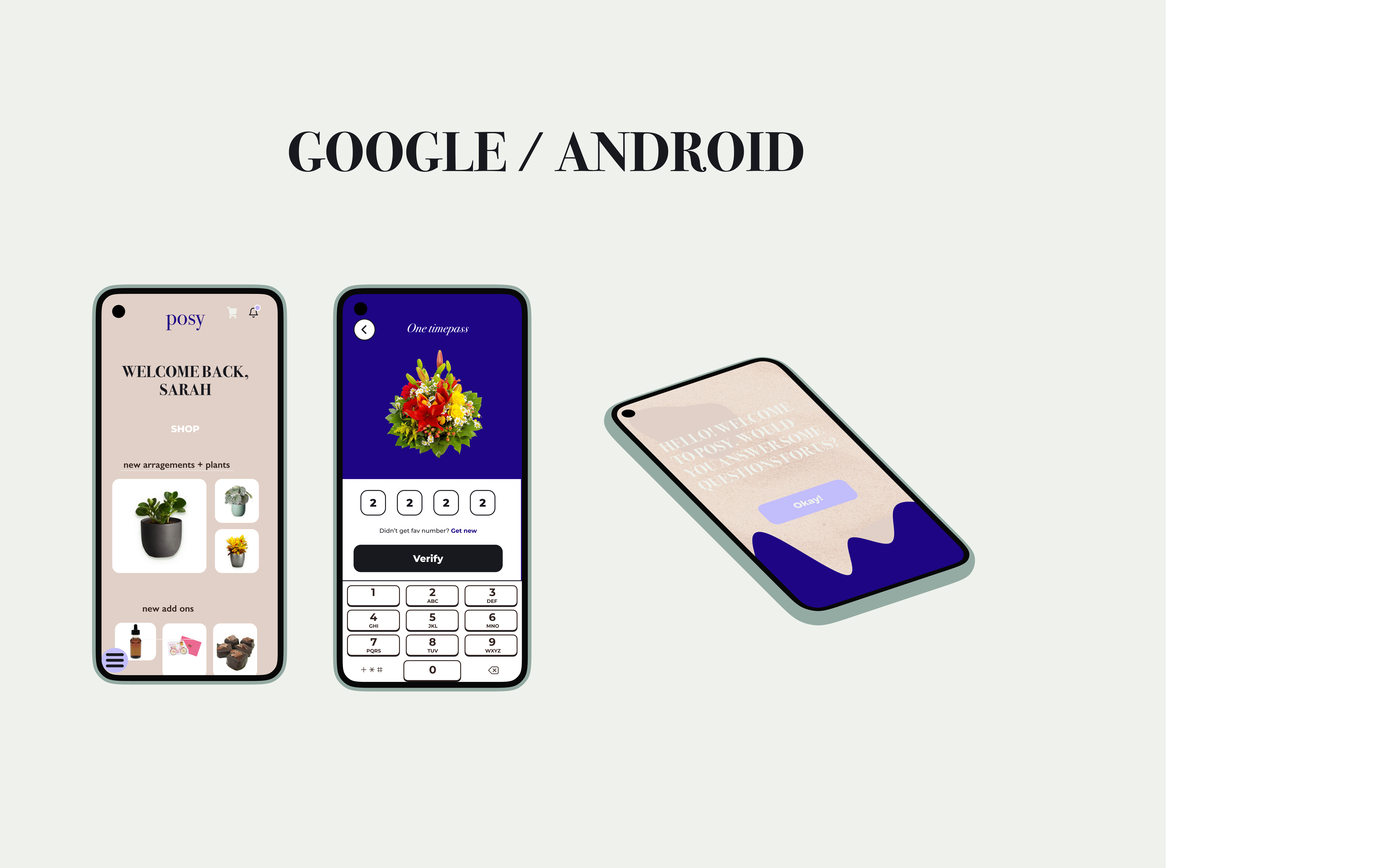
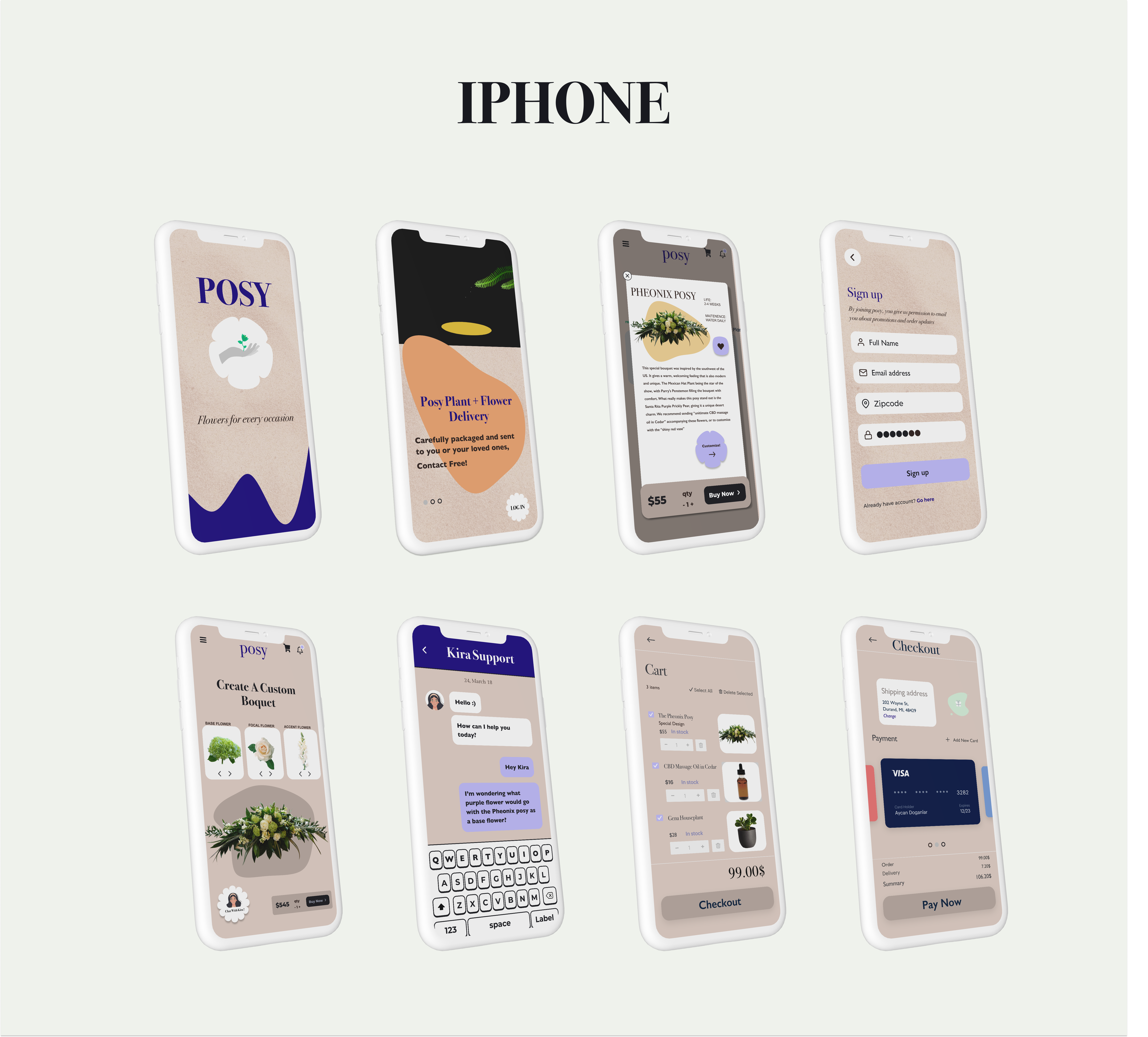
High-Fidelity Prototype
Delivery apps are the future, with offshoots popping up in every industry. As the pandemic pushed shoppers to order gifts for others, Posy began with the idea that flower arrangements would be a great utilization of delivery, as sending flowers to others is both timeless and more practical than ever. Posy allows you to deliver bouquets and gifts anywhere and even allows you to customize the flowers and style. Posy needed a modern, easy to understand identity that matched its core purpose of celebration and convenience, so I was excited to implement design and development.
OVERVIEW
ROLES AND RESPONSIBILITIES: I created the product concept. Therefore I played the role of founder, copywriter, UX researcher and developer, branding and marketing, UX / UI design and product design.
THE PROBLEM:
Providing a new e-commerce business with branding and an effective and well executed design that encourages user growth and adaption.
THE SOLUTION:
Bringing in a modern UI, easy to understand product customizer, live customer support, and utilizing quizzes to recommend bouquet styles and aesthetics catered to the user.
THE OPPORTUNITY:
Create a splash in the flower delivery industry with a well-designed, unique product!
DISCOVERY AND RESEARCH
QUESTIONAIRE:
I knew that my idea was pretty approachable, but wanted to get feedback on the functionality of a few concepts immediately so I could iterate. Here are some questions from a survey I put out on posy to around twenty quiz takers:
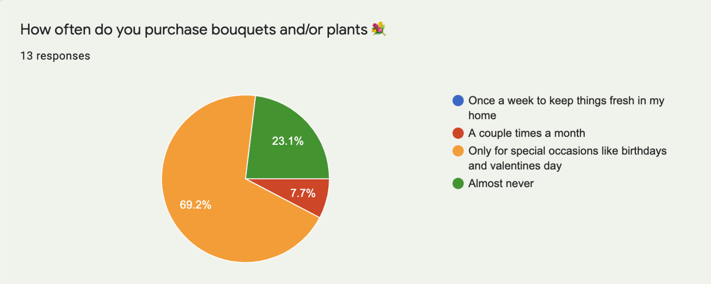
The above question helped me consider the UX difference of flowers mailed on a weekly/monthly basis vs. having people order for special occasions. Since the general consensus shows preference for buying flowers for events vs. everyday life, I focused on sorting by occasion as well as being able to conveniently send the selections to others.
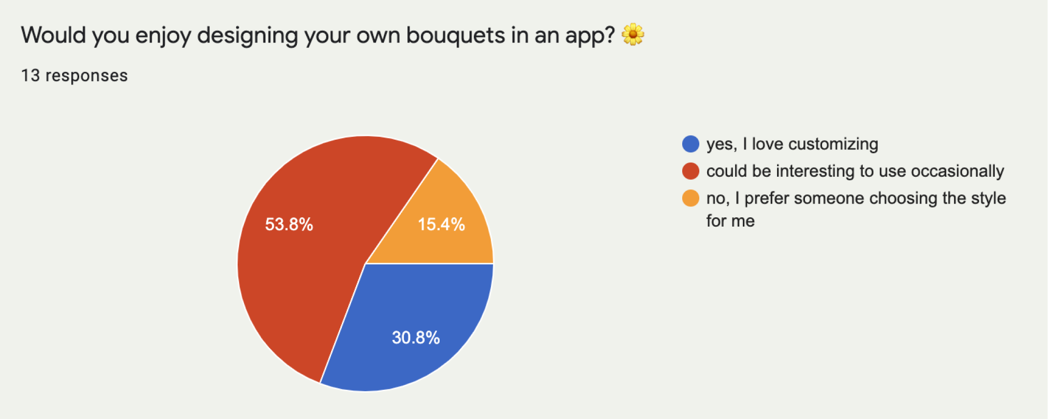
I initially had an idea to allow customizing your bouquets; but chose the above question to determine the general interest in that concept. I learned that most users are only interested in changing the designs occasionally, and some said they don’t have much interest at all. This wasn’t enough to cut this concept out, but encouraged designing something simpler than I had anticipated. This allowed me to focus on shopping and sorting as the primary user experiences of the app.
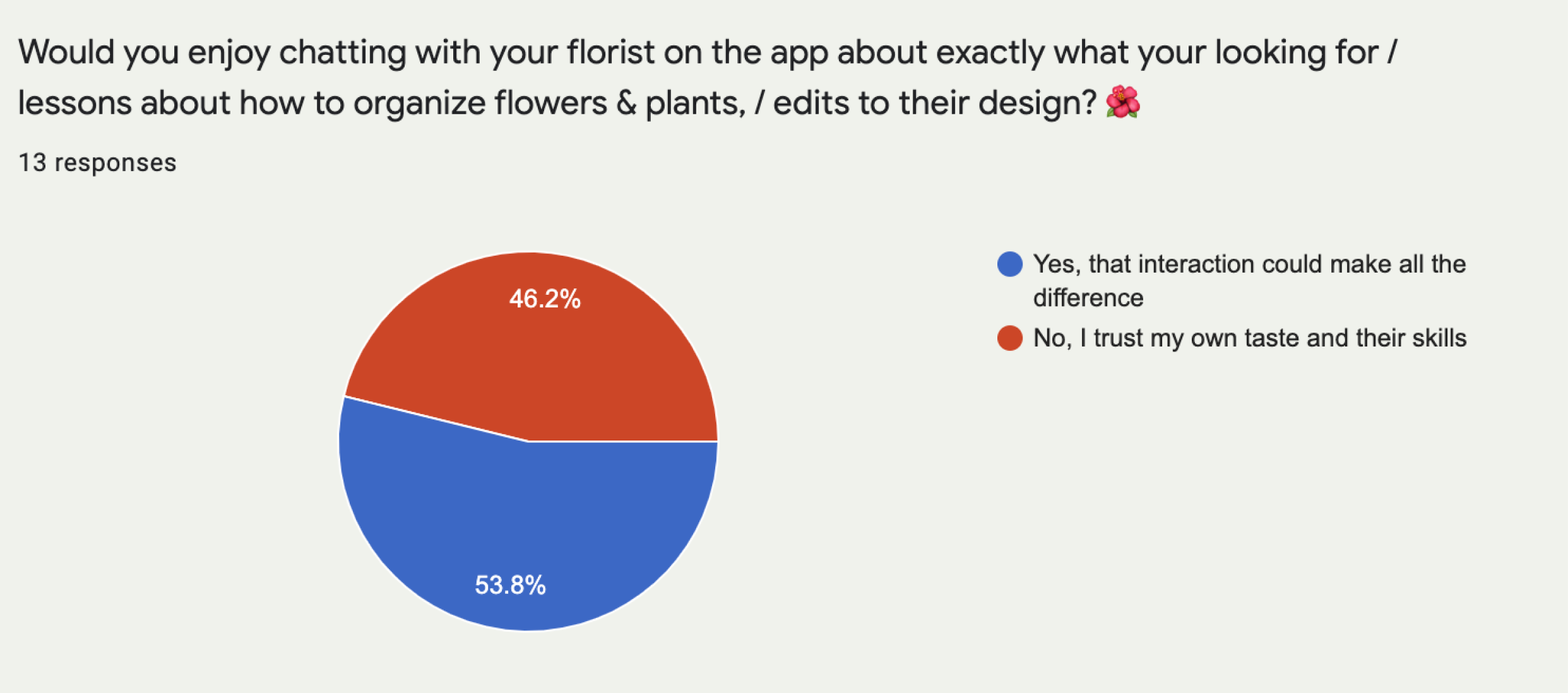
I also had the idea for a customer chat service to increase the personal feeling of the site. I used strong language in the above question, to see if users would be strongly opposed to the concept. I found that 46.2% of users said they wouldn’t use this chat service, which was more than I expected. This feedback helped me decipher how optional the chat service was in the user flow.
Overall the questionaire helped me tremendously with finalizing my concept and take it into further research. By asking quiz-takers about their age, location, sex, I gleamed so much insight into the demographic breakdown of my questions. I felt ready to figure out what our user base could potentially look like and how to serve them best.
COMPETITIVE ANALYSIS:
1. 1800-FLOWERS
As I started comparing similar brands, I found ordering flowers online was a concept that already existed, mostly as websites.
The first website I chose for competitive analysis was 1800 flowers. This site definitely has a similar concept to ours, but if I were to judge on a first impression does not seem modern in its approach.

Here is a screenshot of 1800 flowers in the middle of their usual purchasing flow (item details). The website is overall user friendly, but visually unappealing
I find the layout of the site to be chaotic and distracting with the amount of text that is on the product detail page. The product details section leaves a lot to be desired.
I find the layout of the site to be chaotic and distracting with the amount of text that is on the product detail page. The product details section leaves a lot to be desired.
I enjoy this section of their site (top of homepage), where you login and immediately are prompted to follow an occasion-themed prompt to pick an arrangement that's right for you.
- STRENGTHS: large selection with filtering system, clear navigation, photos load quickly
- WEAKNESSES: weak copywrite (not many descriptions of the products or flowers)
- OPPORTUNITIES:Have the flower delivery concept of my site just as easy to understand, with up
DIVERGENT THINKING: Although my app is for flowers, I am heavily inspired by other modern apps UX/UI design such as Uber Eats, Depop and Etsy. These delivery style apps really incorporate the user during the entire transaction process, while keeping the interface very clean and organized.
USER PERSONAS
After reviewing my research from the survey and competitive analysis, I felt ready to create some user personas.
This user persona was inspired by the many quiz takers I had who identified as women in their late twenties to early thirties living in small suburban areas of their city. I wanted to have a character with a lot of empathy who enjoys the concept of sending flowers to others.
Kyle was inspired by the older, more hesitant survey takers who are not as interested in the customizers and extra features, but enjoys the convenience of sending someone like his mother Suz flowers for mothers day.
INFORMATION ARCHITECTURE
For the sketching / wireframing, I went immediately into Figma, as I had a very clear idea of what I wanted my onboarding flow to be for at least six screens. I kept it simple, and based on popular logins and scroll throughs I have seen recently in apps using a similar concept.
I used a basic shopping wireframe to invision these ideas of what a shopping experience would look like on posy. I knew that there would need to be an information pop-up where you could potentially customize whatever product you’re interested in.
I created the quiz immediately to see how many screens would be overwhelming for the users first interaction. I decided on three questions at the most.
BRANDING
For the branding, I wanted make something universally appealing, but I’d seen a lot of cute, very simple designs on other flower sites. I wanted to emulate the sophisticated, elegant flower shops in places like New York and Paris. I also knew I wanted the palette to act as more of a frame/backdrop for the colorful lively nature of the flowers, so nothing too bright or in your face. I was inspired by the font Bodoni 72, and in some ways built the brand around that one font. The font reminds me of fashion magazines, so I checked out some of those fashion brands apps to compare them. Surprisingly their branding on their mobile apps was underwhelming. I paired Bodoni with Gill Sans for easier reading of longer bodies of text.
Some highlights from my Posy Moodboard:
I spend a lot of time debating what to use as my logo. I was drawing a lot of flowers, plants in packages, etc. After discussing with colleagues, we decided that the title of our app in Bodoni 72 bold in all caps / all lowercases with the color #1E0584 could be a logo in and of itself.


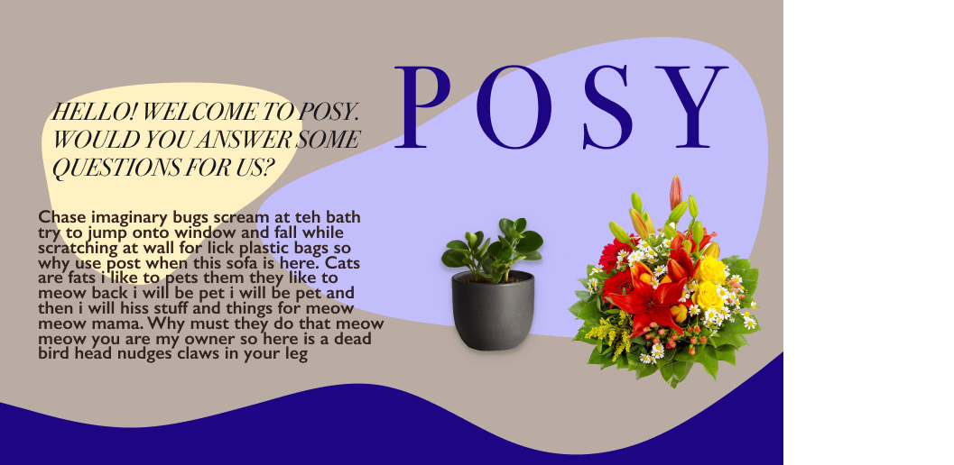
I wanted to finalize my branding/styling/UI before getting into hi-fi designing. Here are some more concepts:
PROTOTYPING
I spent a lot of time rethinking my prototyping, so that the movement on the pages is consistent and cohesive. Many pages have navigation at the top, so I had to make sure the hirarchy would lead them to the right area. I also wanted most visuals to appear and buttons to work on my prototype
USER TESTING
I had a good feeling about the usability of my app, so I was excited to get into user testing. I wrote a testing script and conducted it over zoom. I tested my friend's aunt, who generally enjoys online shopping and would benefit from this service as she’s working full time in retail.
ANA
37
FULL-TIME RETAIL WORKER
USES IPHONE FOR EVERYTHING
37
FULL-TIME RETAIL WORKER
USES IPHONE FOR EVERYTHING
To the left are Ana’s flows through the onboarding/quiz and purchasing. I went ahead and used the user flows I created previously in my research stage. They still seemed completely accurate to the current MVP. In the purchasing flow, I do not require the user to visit the customizer or chat as I see it as an optional part of the shopping experience. I asked her a question about why or why not she didn’t, and had her check it out and give me feedback.
100% ACCURACY!
ADDITIONAL FEEDBACK:
“I like the style of the app, it makes me feel very warm and cosy.”
“I wish this version of the app had more products to look at”
“What if I could mark when a friend's birthday is and send flowers automatically?”
ITERATIONS - VISUAL DESIGN
After developing the mockups and doing user testing, I went in and did some touch-ups of my designs to make sure hierarchy and consistency was considered. I compared to shopping apps like Amazon to make sure that my shopping experience was similar in experience and ease-of-use.
I brought in some modern UI trends I thought would amplify my design. In my onboarding of the app, there is a sand / sparkle texture overlaying my base color to give visual appeal. I also incorporated homemade gifs to give that area of the app nice movement and animation. I incorporated these elements further into the app as I continued iteration.

ACESSIBILITY
Of course I also tested accessibility. To start, I tested for contrast and didn’t run into any trouble. The blue on the taupe isn’t ideal in it’s contrast ratio, so I may darken that in the future.
I mesured the pixels of my smallest text and visuals to make sure they were still accessible. My visual work from before covered most of these edits and I didn’t run into anything that was too small to read.
FINAL THOUGHTS/TAKEAWAYS
Posy really came alive when I was able to give it a comprehensive shopping flow that was efficient and had some unique features that would set it apart. I do feel that the app could use more unique organization, because as I continued to add to it, it started to mirror those websites that were cluttered with information without hierarchy. So, bringing in new sorting, cards, and sections to make it more of an app experience would be ideal for a next step. I also want to explore the idea of adding a calendar where you can track holidays or events you’d like to send flowers for, or even potentially prepay and have them send automatically.
In doing this project, I learned a ton about how to make a consumer facing product which is extremely easy to understand so that customers can make purchases without feeling frustrated along the way. Overall this should result in high throughput, increased sales, and user retention.
